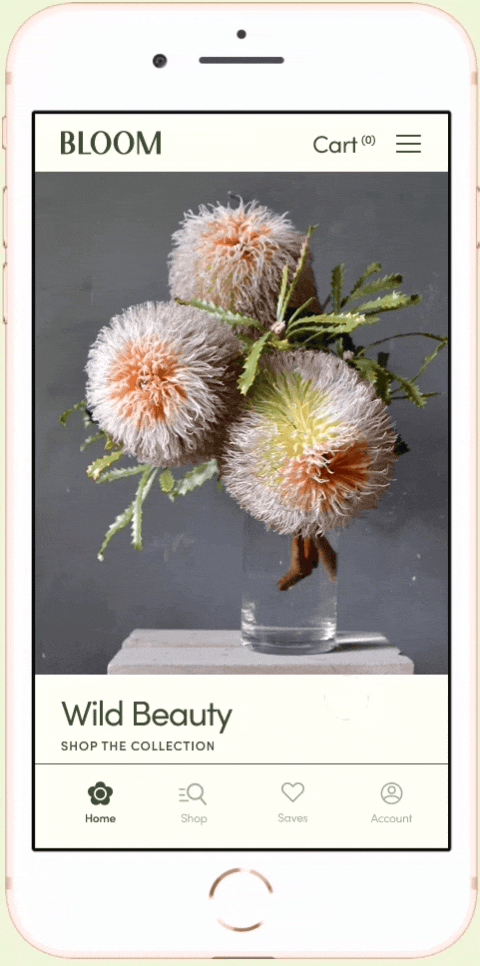
Bloom Floral Studio App
GOOGLE UX DESIGN CERTIFICATE PROJECT
This work was part of a required assignment for the Google UX Design Certification. Individually, we were assigned a prompt and then were responsible for working through research, user interviews, and design phases to complete a final app experience. My prompt was to "Create an app for a local florist".
Role UX Designer, Researcher, & Protoyper
Project Vision
Bloom Floral Studio is a sustainable, high-end floristry practice local to San Francisco. Bloom is looking to take their floral program online to streamline orders and provide more convienience for clients.
Bloom Floral Studio — Ethos:
Artisan Approach over Build Your Own Bouquet
Local Reach over Global Reach
Slow & Timeless over Fast & Trendy
Project Goals
- Provide an elevated, curated app experience
- Deliver a seamless, linear purchasing flow
- Add helpful features that support business goals and enrich the client shopping experience
Project Flow
- Conduct Research & Test Early Concepts
- Build Wireframes & Low-Fidelity Prototypes
- User Interviews, Testing & Insights
- High-Fidelity Designs & Final Steps
Initial Research & Personas
Along with a competative business audit, I also completed two user interviews with patrons of my local florist shop.

ALYSSA
"I love to order beautiful products that
I can't get anywhere else."
Alyssa is a 28-year-old project manager at an advertising agency. She lives in San Francisco with her Maltese puppy and works a demanding schedule. Alyssa likes to treat herself to beautiful things whenever she can. She purchases flower arrangements for delivery regularly for herself and as special gifts for friends and family.
DAVID
"I want to order flowers for birthdays, but
when I remember, it's too late to order."
David is a 40-year-old senior-level creative at a software company. He lives in San Francisco with his wife and two young girls. David struggles to balance work and relationships at times and would like to send something special for celebrations more often. He would like an easier way to remember when he needs to purchase a gift for someone.
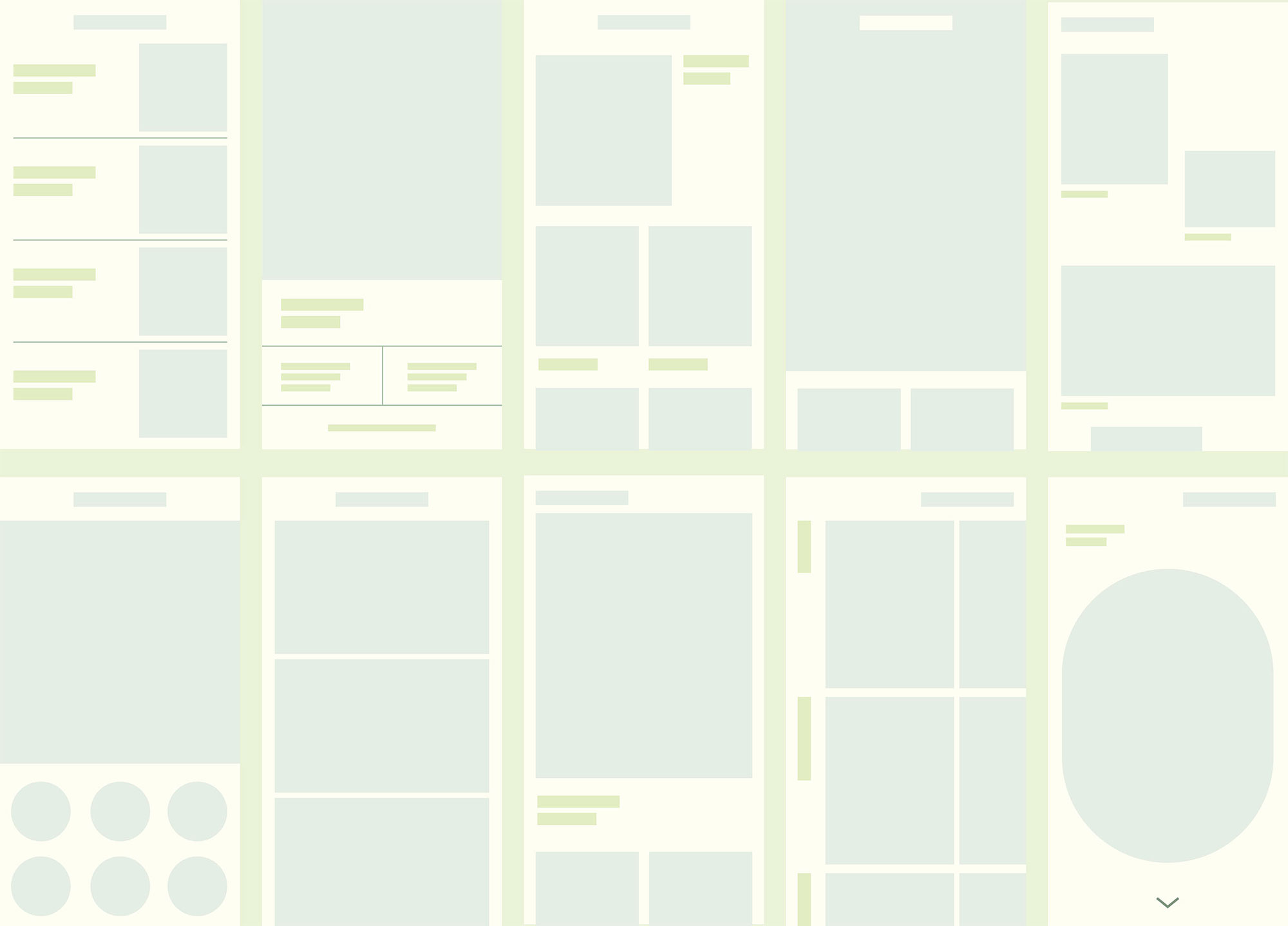
Wireframes &
Navigation Structure
After collecting information from users, competitors, and additional research, I iterated on wireframe designs to find the appropriate fit for Bloom Floral Studio and their business needs.
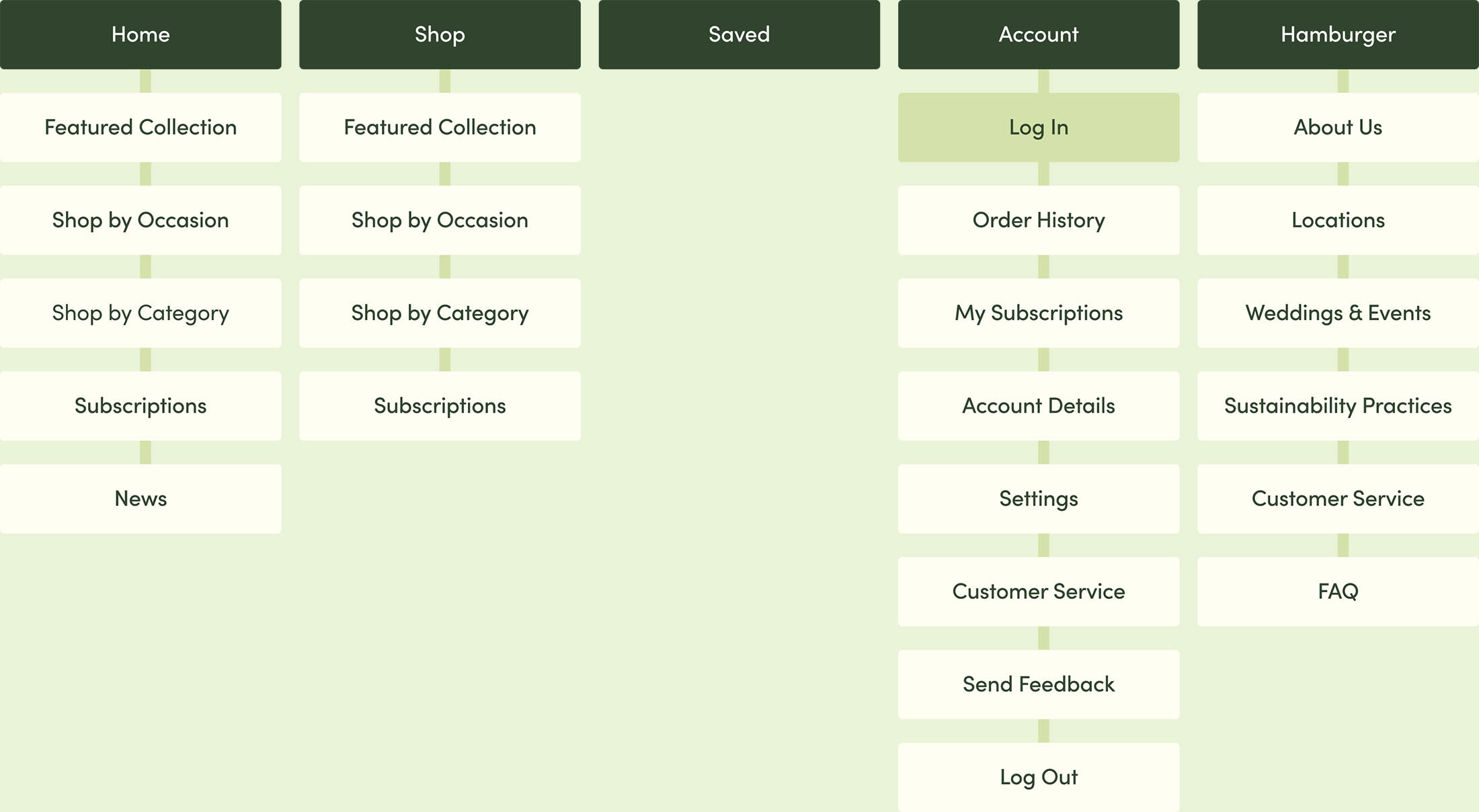
Navigation Structure
At the same time, I also explored different options for navigation, including a hamburger menu and bottom bar. My goal was to create a structure that didn't feel repetative but provided an experience where clients could easily find or discover what they were interested in.
I landed on a bottom nav that contains Home, Shop, Saved, and Account tabs, while relying on a hamburger menu to hold additional information that otherwise might get lost.
For the Home and Shop tabs, I decided to repeat some of the same information but in different ways so that people who think visually or linearly coud both find what they need.
User Interviews
& Testing
I asked 5 participants to run through
my prototype to get feedback on the purchasing experience.
Qualitative Study Details
Participants: Were between the ages of
18-62 and reside in metropolitan and suburban areas. They order flowers at least once a year and like to shop local.
Duration: 20 minutes, remote moderated
usability study
Task: Users were asked to submit an order
on a low-fidelity prototype
Study Questions
- How long does it take a user to find and order flowers in the app?
- Are users able to add on products easily in the order process?
- What can we learn from the user flow, or the steps users take to place an order?
- Is the delivery scheduling process easy for the customer?
Study Results: Pain Points

ONE
The checkout process is too tedious
2 out of 5 participants felt that the checkout process was too long and 1 participant did not complete the process.

TWO
It's difficult to browse by occasion
2 out of 5 users preferred to browse by occasion since they only visit this type of business if they have an upcoming celebration. Users had trouble finding the "shop by occasion" feature when they looking for it immediately upon opening the homepage.
PAIN POINT ONE
The checkout process is too tedious
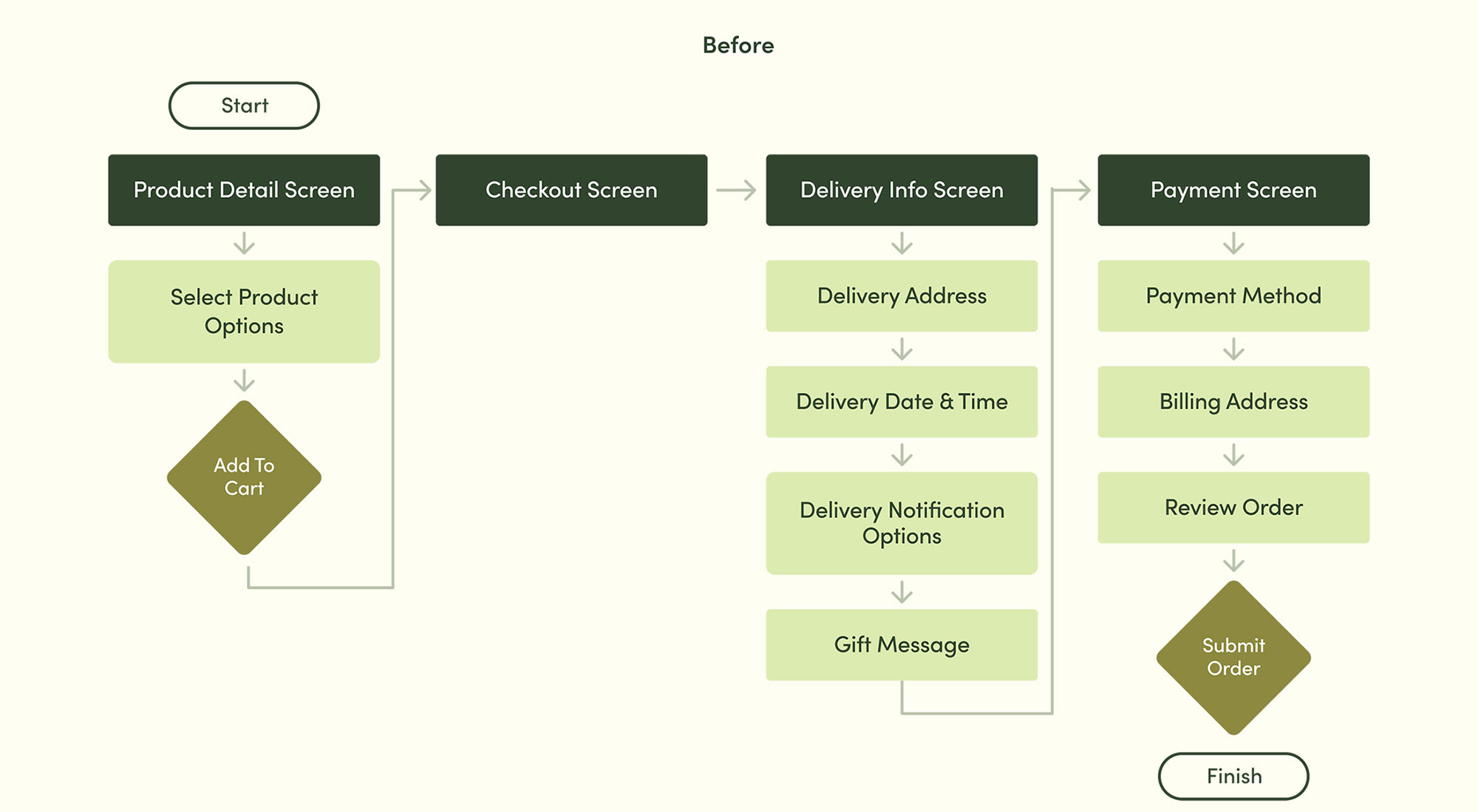
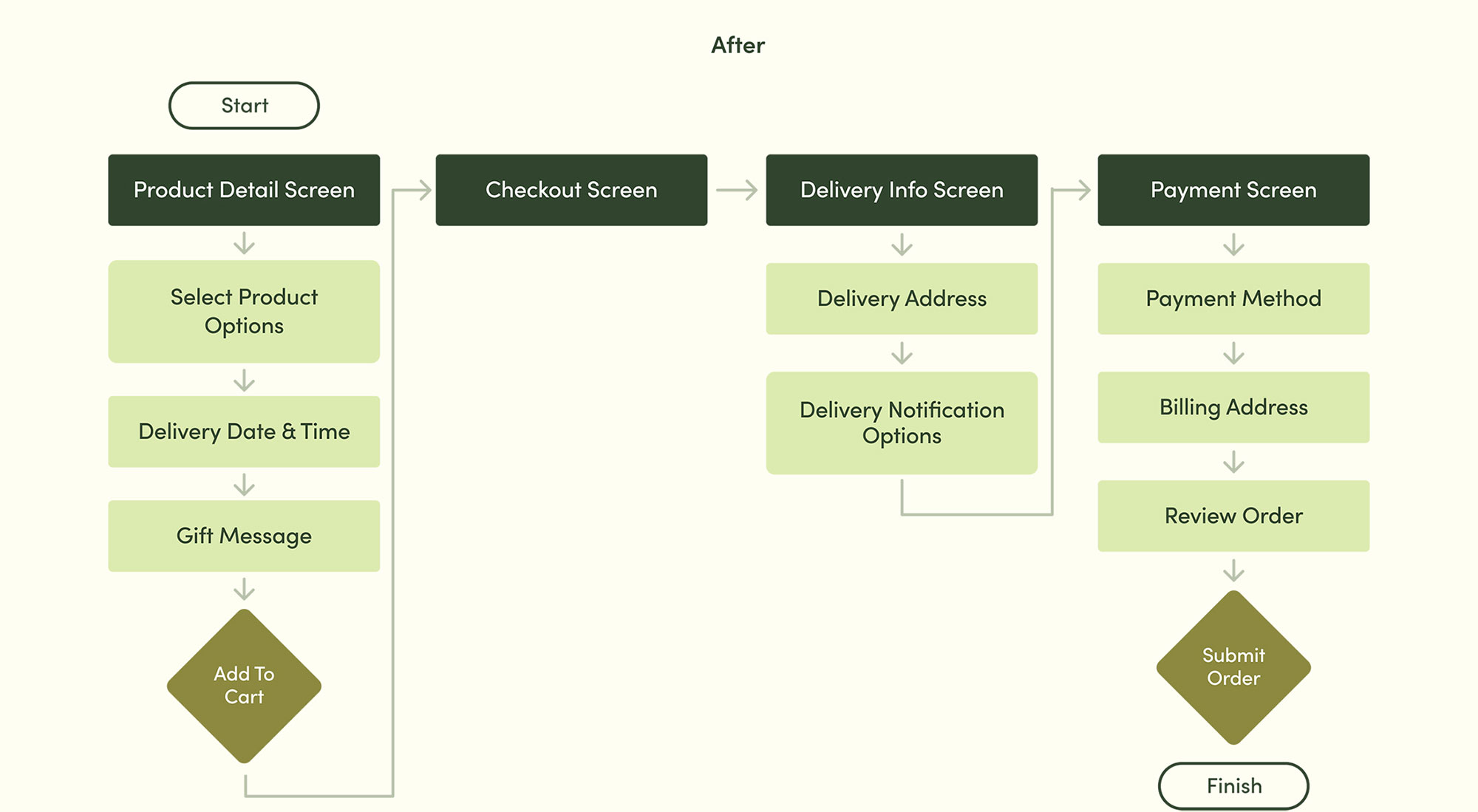
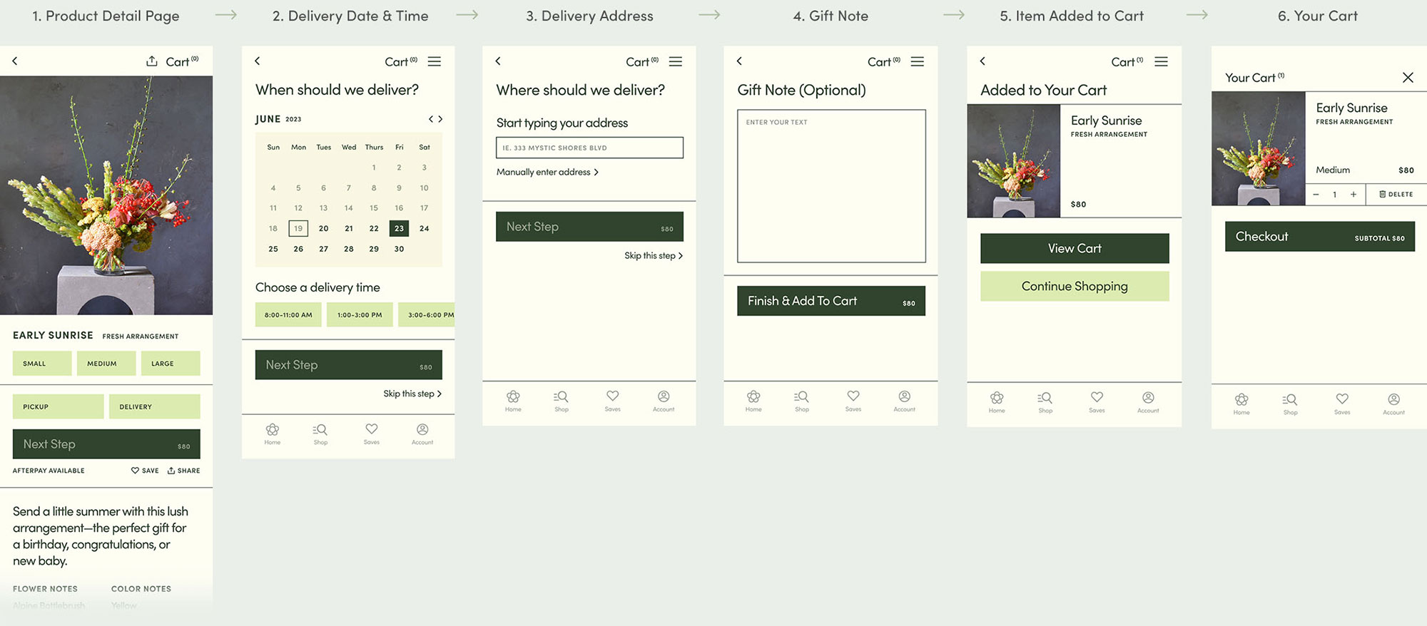
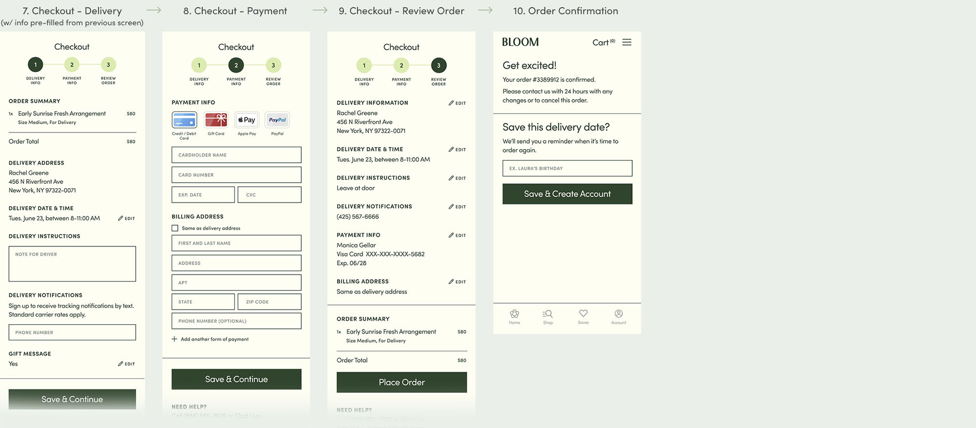
Since the Bloom Floral Studio needs more information to deliver a floral order, the checkout process needed to retain all of the input fields that it currently had. Instead of trying to pare down the information to make the process shorter, I chose to move some of the fields sooner in the checkout flow process. By having clients fill out some information up front, the purchasing experience feels less tedious, and clients have reached the payment screen before they know it.
PAIN POINT TWO
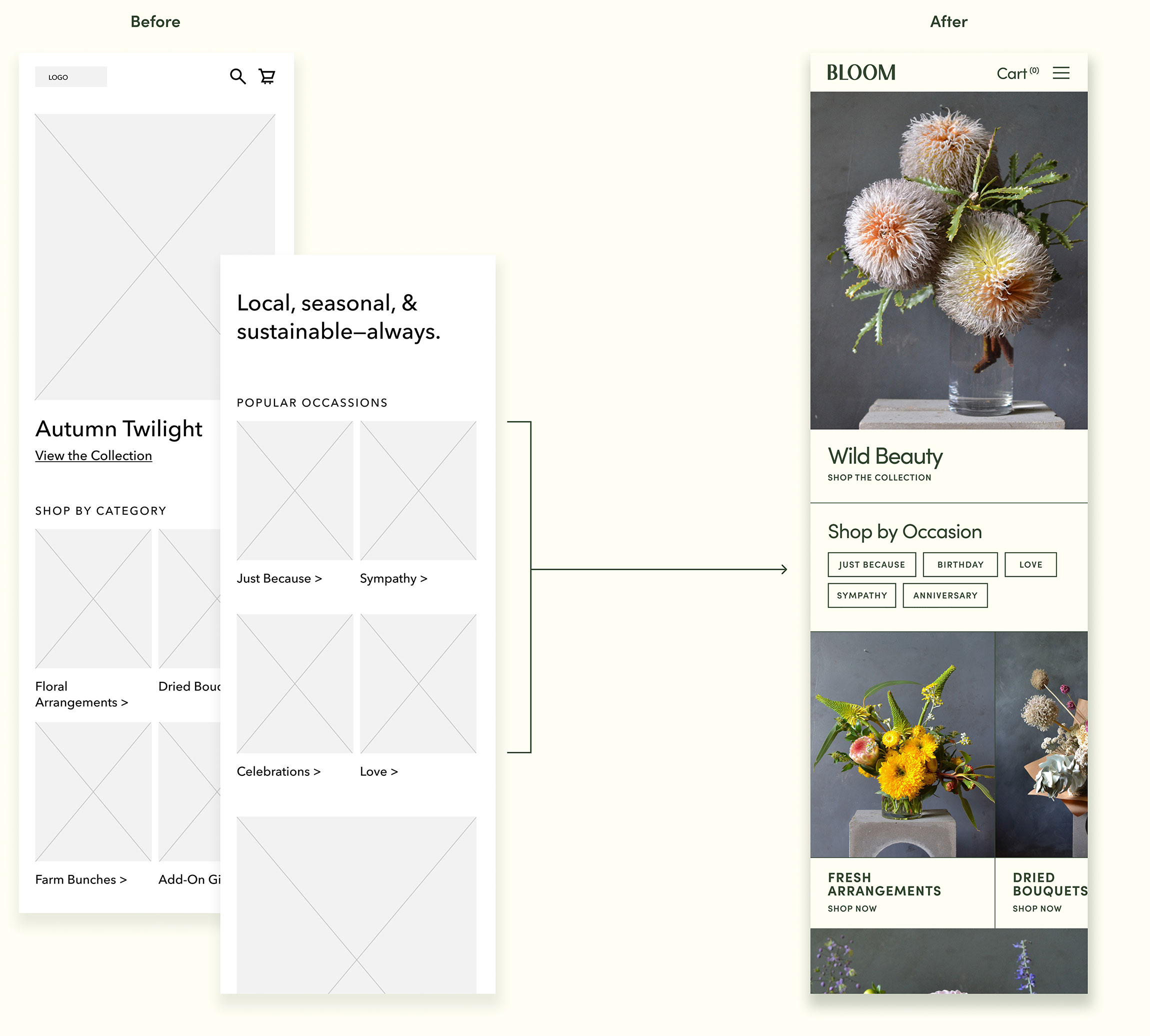
It's difficult to browse by occasion
To solve this issue, I moved the "Shop by Occasion" section higher on the page and changed the design
from images with links to simple buttons to take up less space.
Addressing User & Business Challenges
CHALLENGE ONE
Offer clients a high-end, curated experience
Bloom Floral Studio clients expect a high level of quality in the product, and this should extend to the online experience.
CHALLENGE TWO
Provide seamless, linear purchasing experience.
The app's main use will be to offer a quick and simple way to order flowers online. It should feel easy to browse, find, and order items.
CHALLENGE THREE
Provide helpful features that support business goals
Additional features should enrich the shopping experience.
CHALLENGE ONE
Offer a high-end curated experience
To give the app an elevated feel, I choose a base of muted colors with a dark forest green to avoid a look that was overly feminine.
The sans serif font feels substantial and gives the app a modern look while being easy to read and navigate.


CHALLENGE TWO
Provide a seamless, linear purchasing experience
As mentioned in the Pain Points section, the checkout experiece felt too long to some users and they quickly grew fatigued. By moving some of the screens to the "Add to Cart" phase of the checkout process, I was able to alleviate those feelings and provide a more simple and easy checkout experience.
If a client doesn't feel like filling out a form field during the "Add to Cart" phase, they are always able to add that information later on in the checkout process.
Full Payment Flow
CHALLENGE THREE
Provide helpful features that
support business goals
I wanted to help solve David's dilemma from the intial research phase. His problem of not being to order in time resonated with other individuals and is something that I can empathize with. For Bloom Floral Studio, patrons need to order at least a week in advance to have their flowers delivered on a specfic day, like a birthday.
I created this "Save an Occasion" feature so that clients can easily set a special date and the app would remind them 14 days in advance. That way, they would have ample time to place a delivery order.
"I want to order flowers for birthdays,
but when I remember, it's too late to order."
— DAVID, FLORIST PATRON
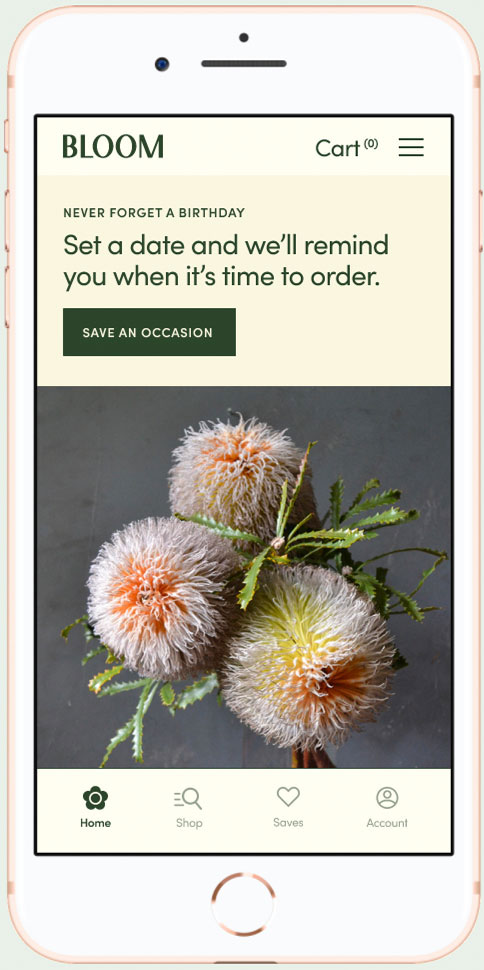

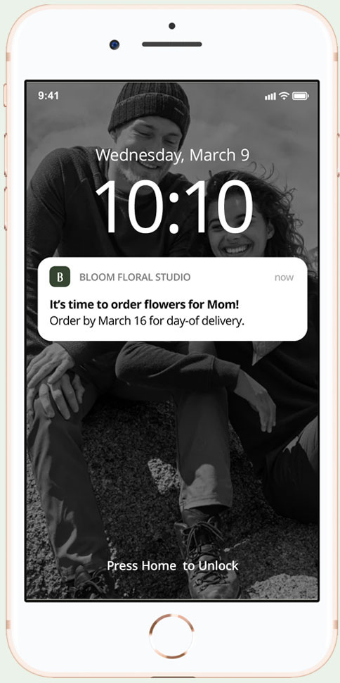

1. New visitors are served a top banner on the Home screen (logged in version shown) 2. Users are asked to fill out basic information including the date, occasion type, and how they want to be reminded. 3. If a user selects "remind by text" they will receive a message 14 days in advance of the delivery day 4. For logged in users, a reminder banner will display 14 days in advance of the delivery date, and will switch to prompt the user to create a pick up order when it is too late for delivery.
Project Reflection
This project was one of the three assignments required to complete the Google UX Design Certificate. The course took me about 4 months to complete with this assignment taking the longest. This app project was a lot of work, but it was interesting and allowed me to try new roles I haven't experienced, like user research and working with participants to test the product. I enjoyed learning about those roles as well as exercising my existing app experience on something new.